Design | Marketing | 03.11.2019
Website Navigation: Getting from Point A to Point B
When it comes to building a great website, it’s hard to understate the importance of your website navigation. Though it’s not as flashy as some other topics, getting it wrong could cost your business tens of thousands of dollars.
For instance, consider the following blunders:
- A prospective client doesn’t realize that you offer a specific service so they don’t reach out to you
- An existing customer loses trust in your brand because your navigation is so confusing
- Your website navigation is so convoluted that a third or more of your visitors don’t understand what your company even does
Want to steer clear of such mistakes? Keep reading and I’ll get you 6 pointers for creating rock-solid navigation.
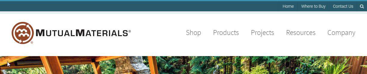
1. Be Choosy with the Number of Links in your Website Navigation
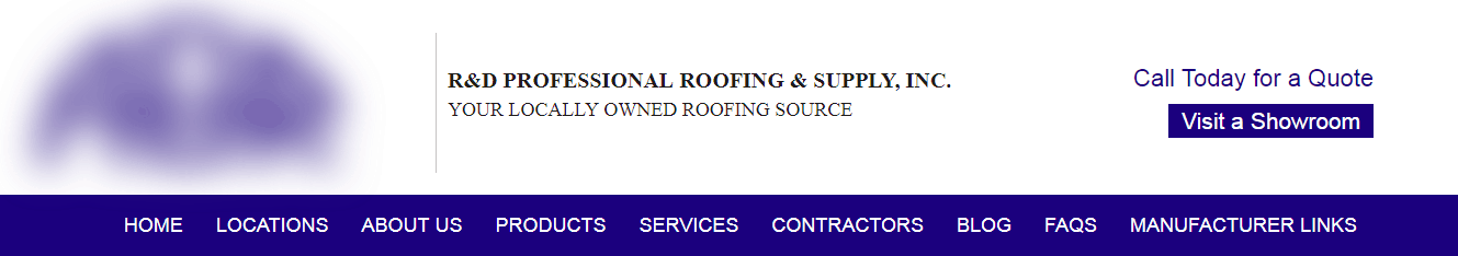
When you have too many links in your site navigation it’s very easy for your visitors to get overwhelmed. Often times, visitors on your website are typical internet browsers: they’re limited on time, they don’t want to read, and they want quick answers.
Too many nav items will require more mental energy to discern what your company is all about. Make it easier for users to understand by grouping topic together with submenus. For instance, with the example above, this company could put “Blog” & “FAQs” all under “About Us”. Instead of 9 links, they could have 7. To get down to 6, they could nix “Manufacturer Links” and place a link to this page in their footer or somewhere else on their website.
The principle here goes back to a design philosophy I learned back in my early years — something we say at my web design agency: “When everything is bold, nothing is bold”. Or better yet, “When everything is important, nothing is important”.
[blog_callout text=”When everything is important, nothing is important.”]
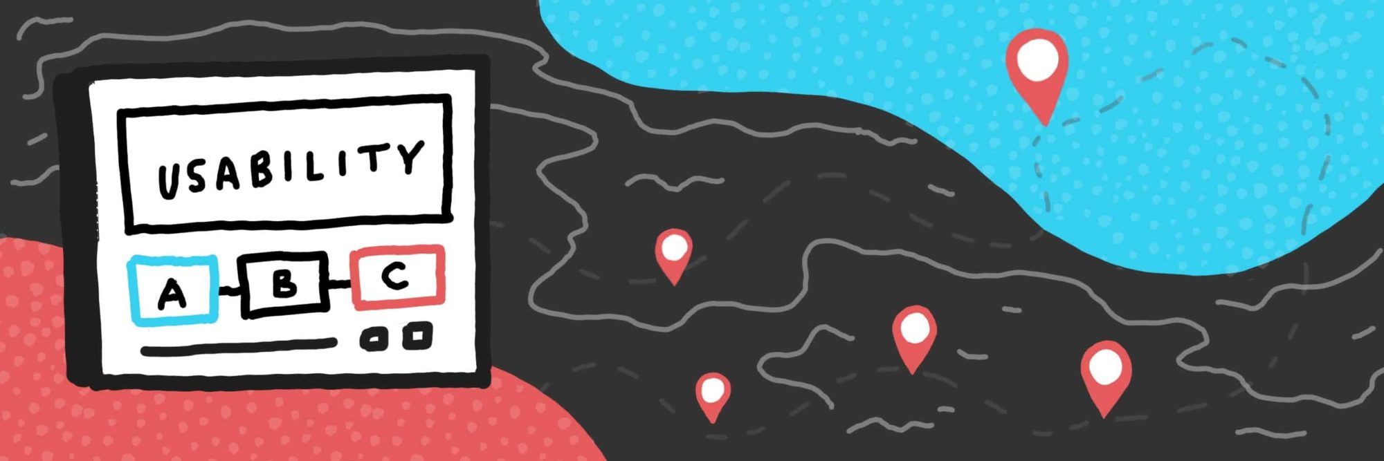
2. Prioritize Usability
Look, I get it. Your website needs to look nice.
But your website aesthetics should never compete with the ability of your users to actually use your website. For example, look at this screenshot below:
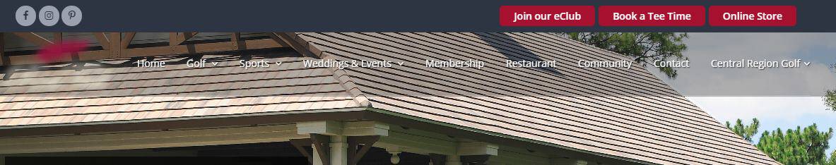
For this golf website, the company has decided to use a nice photo from one of their golf courses. Unfortunately, the photo they chose is causing readability issues with their website navigation. In this case, it would be better to choose a different photo altogether.
Another example of bad usability is using skinny flyout menus… you know, the menus where if you hover off for just a quick second the whole menu disappears?
I can’t illustrate this perfectly with just an image, but when I was on the website above it was very easy to switch to different menus accidentally or lose the menu altogether if I didn’t have it just right.
Your navigation menu shouldn’t be a test of your user’s fine motor skills. If it’s hard for them to use, you’re doing something wrong.
[blog_callout text=”Your navigation menu shouldn’t be a test of your user’s fine motor skills.”]
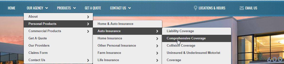
3. Consider Using a Utility Bar
A utility bar or an “ancillary navigation bar” is another section of navigation where you can place important, but secondary links. For instance, look at how this employee benefits company placed their news, faqs and contact link on the top right.

Using a utility bar allows you to have more links while making some prominent and others de-emphasized. This technique allows the user to naturally understand that some topics are of higher priority in your website navigation.
Here are a few more good examples of using a utility bar. Notice the links on the top right of each header:


Utility bars are super helpful but still relatively uncommon for many companies when they’re designing their website.
4. Use Simple Naming in Your Website Navigation
For my fourth tip on creating effective website navigation, I’d like to suggest using simple naming conventions for your navigation items.
When possible, use one or two words and remove unnecessary words. For instance “About” vs. “About Us”. Does the word “Us” really add anything? Isn’t it implied? Here are more examples:
- “Contact” instead of “Contact Us”
- “Work Samples” instead of “View Work Samples”
- “Locations” instead of “Our Locations”
- “Financing” instead of “Financing Options”
Now a word of caution here: the goal is to remove unnecessary words but not crucial words. If pruning away a word in your website navigation brings about confusion in your users’ mind, you’ve gone too far.
Just remember that every word you’re adding has the opportunity to add clutter. If you have a longer individual nav item, consider fewer navigation options as a whole.
[blog_related url=”https://www.jordancrown.com/blog/how-to-create-a-modern-website/” label=”How to Create a Modern Website”]
5. Focus on the Right Pages
Sometimes when companies are working on their website it’s easy to make mistakes that have obvious ramifications. We do this because it’s often the case that we “can’t read our own labels”. Here’s a simple but powerful principle: prioritize your most important pages.
Do you sell a product or service? Well, you should probably put informational pages for these in front of biographical content about your company.
What do you want your visitor to do? What are your top 2 or 3 goals? Make sure to focus on these goals when you’re laying out your navigational hierarchy.
Cars.com is a good example of getting this right:

What are the top 3 priorities Cars.com has for its customers?
- To browse listings (“Cars for Sales”)
- To sell their car (“Sell Your Car”)
- To connect you with service centers for your car (“Service & Repair”)
They’d also like to help you with research and they pitch their blog, but these are of lesser priority when it comes to their top goals.
6. Create a Clear Call-to-Action
Finally, for my last tip, considering creating a call-to-action in your website navigation that reflects your number one goal for your website. This will vary with each industry, but here are some examples:
- A professional services company: “Request a Quote“
- An e-commerce store: “Sign In“
- A roofing company: “Schedule an Estimate“
- A software service: “Create a Free Account“
Here are some visual examples of an effective CTA:


Can you spot the specific calls-to-actions on each of these examples?
Help your prospect understand the big idea by creating a simple, easy-to-understand “next step”. Though it may be obvious to you, your prospect doesn’t know your business like you do. You need to tell them what to do next.
Conclusion
Well there you have it. 6 straight-forward tips for creating effective website navigation.
Put these principals to action and your website visitors will find more clarity around who you are and what you do. Disregard these rules and you may find a shrinking market share or pipeline. A quote from Donald Miller is quite appropriate here: “If you confuse, you lose”.
Did I miss anything? Questions? I’d love to hear your feedback in the comments section below.